Corporate Design (CD)
What is Corporate Design?
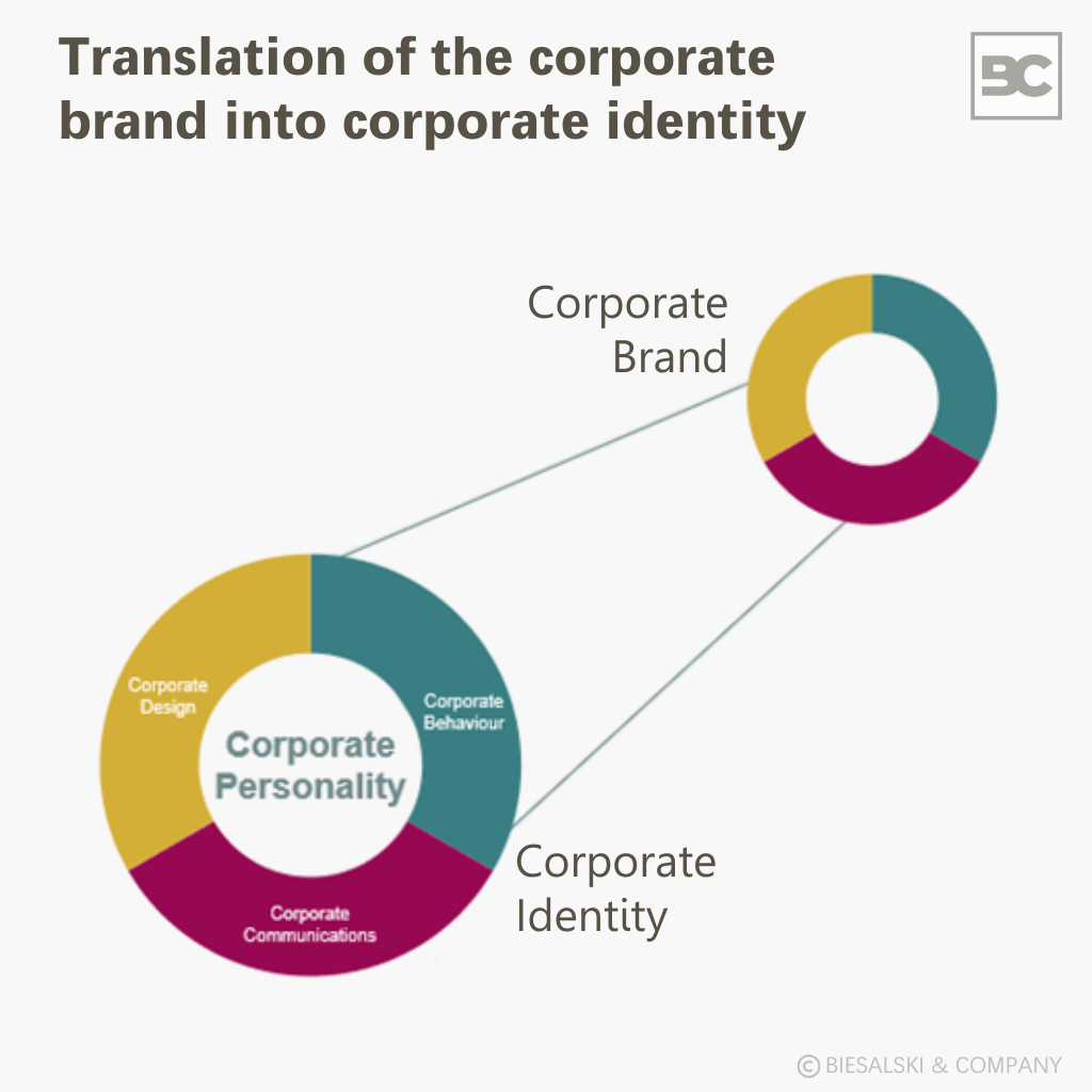
Corporate Design refers to the comprehensive visual design of a company. It is a central element of corporate identity and encompasses all visual forms of expression through which a company presents itself both internally and externally. These include, among others:
- Logo: Central identifying mark and symbol of the brand
- Color scheme: Definition of specific brand colors for all media
- Typography: Selection and use of consistent corporate fonts
- Visual language: Style guidelines for photos, illustrations, and graphics
- Design guidelines: Rules for the application of design elements
The goal of corporate design is to make the brand’s values, vision, and personality visible and to clearly differentiate it from the competition. While corporate design shapes the “face” of a brand, corporate identity describes its entire self-concept, including communication and behavior.
Why is Corporate Design important for companies?
A consistent corporate design strengthens brand recognition, increases brand preference, and fosters trust among customers, partners, and employees.
Internally, it supports employees’ identification with the company and serves as a cultural link. Externally, it conveys professionalism, clarity, and credibility – crucial factors for brand perception.
In strategic brand management, it functions as a tool for differentiation and creates a unified presence across all touchpoints.
How to develop an effective Corporate Design?
An effective corporate design does not arise by chance – it is the result of a structured, strategically guided process:
- Analysis phase: The starting point is a precise brand analysis, including market, competition, and target group considerations.
- Concept development: Based on the brand strategy, a visual system is developed that embodies the brand values.
- Implementation: The design is applied to all relevant media, channels, and touchpoints – both digital and analog.
- Internal anchoring: Only when employees understand and apply the design principles can a consistent brand impact be achieved.
A professional briefing and close alignment with the brand strategy are crucial to success.
What belongs in a Corporate Design manual?
A Corporate Design Manual (also called Brand Manual or Style Guide) is the central document for ensuring a consistent brand appearance. It includes, among other things:
- Logo variations and protection zones
- Color definitions (e.g., CMYK, RGB, HEX)
- Use of corporate fonts and typographic guidelines
- Image style and visual tonality
- Application examples and “Dos & Don’ts”
Beyond the pure design description, the manual also serves as a control tool for external service providers, new employees, and agencies.
What is the difference between Corporate Design and branding?
Corporate Design is the visual outcome – branding is the strategic blueprint behind it. Branding encompasses all measures for developing and managing a brand, including positioning, brand values, tone of voice, and brand experience. Corporate Design is the visible translation of these strategic foundations into a consistent design system.
When should a Corporate Design be updated?
An adjustment or redevelopment of the corporate design is advisable when:
- the company undergoes a strategic realignment
- there are mergers or name changes
- the current design is no longer up to date
- the brand effect is inconsistent or weak
- the company undergoes a strategic realignment
- there are mergers or name changes
- the current design no longer appears contemporary
- the brand impact is inconsistent or weak
Regular reviews ensure that the design remains relevant and continues to appropriately convey the brand core.
Avoid these mistakes with your Corporate Design
A strong corporate design only unfolds its full impact when applied consistently and strategically. Common mistakes include:
- Inconsistency due to missing design guidelines: Without clear specifications, deviations in the use of logo, colors, and typography quickly occur – recognition suffers.
- Lack of target group orientation: If the design is not aligned with the expectations and habits of the target group, it misses its communicative effect.
- Missing strategic foundation: A design without reference to brand identity appears arbitrary and weakens positioning.
- Visual overload: Too many visual elements disturb clarity. A reduced, focused design is often more effective.
- Following trends instead of timelessness: Short-lived design trends carry the risk of rapid obsolescence and lack of brand fit.
- Inappropriate choice of colors and shapes: Design elements must match the brand message and target group – otherwise, misassociations arise.
- Lack of scalability and practical usability: An effective design works across all media – from smartphones to trade fair walls.
- Lack of originality: Those who merely copy existing designs forgo differentiation and brand profile.
Contact
Would you like an informal discussion on the topic? Our experts are available to assist you at +49 89 273 73 54 00 or via email at info@biesalski-company.com.
Here you can also find more information about Biesalski & Company’s range of services in the field of Brand Strategy.
Sources & reading tips
- Forbes Communications Council. (2024, December 30). The importance of consistency in branding. Forbes. https://www.forbes.com/councils/forbescommunicationscouncil/2024/12/30/the-importance-of-consistency-in-branding/
- Karjalainen, T.-M. (2007). It looks like a Toyota: Educational approaches to designing for visual brand recognition. Research in Engineering Design, 18(3), 173–186.
https://link.springer.com/article/10.1007/s00163-017-0262-7 - McKay, A. (2023). Co-creation and the role of design: A design research society perspective. DRS Conference Papers. https://dl.designresearchsociety.org/cgi/viewcontent.cgi?article=2182&context=drs-conference-papers
- Schillinger, M. (2014, June). 4 design mistakes corporations should avoid. Harvard Business Review.https://hbr.org/2014/06/4-design-mistakes-corporations-should-avoid
- Walsh, M. F., Winterich, K. P., & Mittal, V. (2010). Do logo redesigns help or hurt your brand? The role of brand commitment. ResearchGate.
https://www.researchgate.net/publication/228137545_Do_Logo_Redesigns_Help_or_Hurt_Your_Brand_The_Role_of_Brand_Commitment - West Virginia University. (2025, February 12). Building brand consistency across channels. WVU Marketing Communications Today.
https://marketingcommunications.wvu.edu/professional-development/marketing-communications-today/marketing-communications-today-blog/2025/02/12/building-brand-consistency-across-channels